An AI image generator, redesigned so first-time users can describe what they see in their head, and actually get it back.
The Product
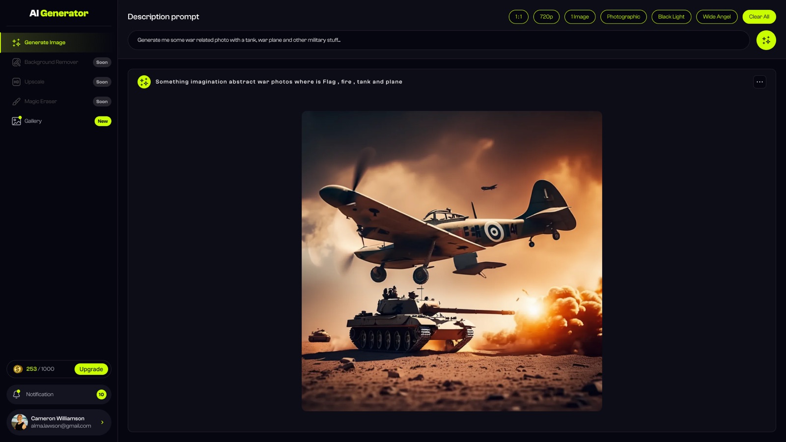
Same system, in your pocket
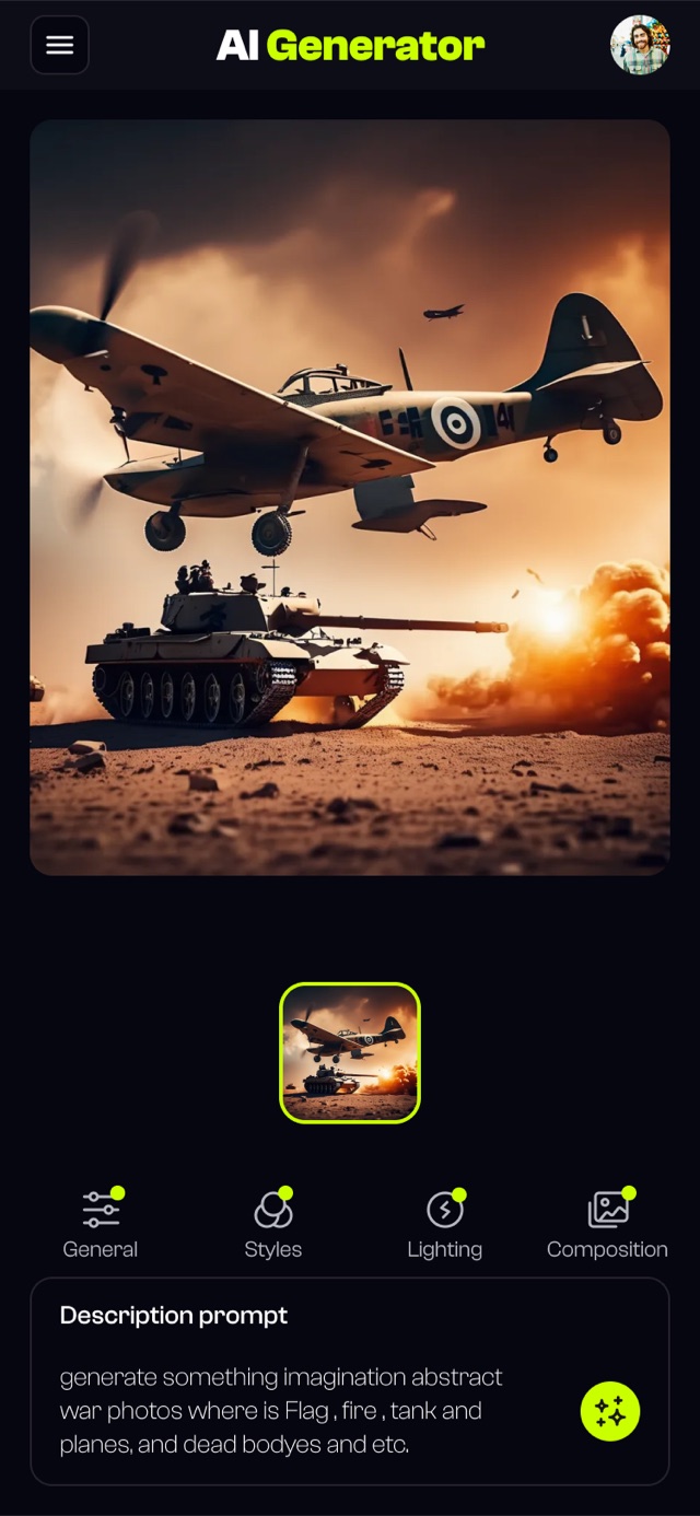
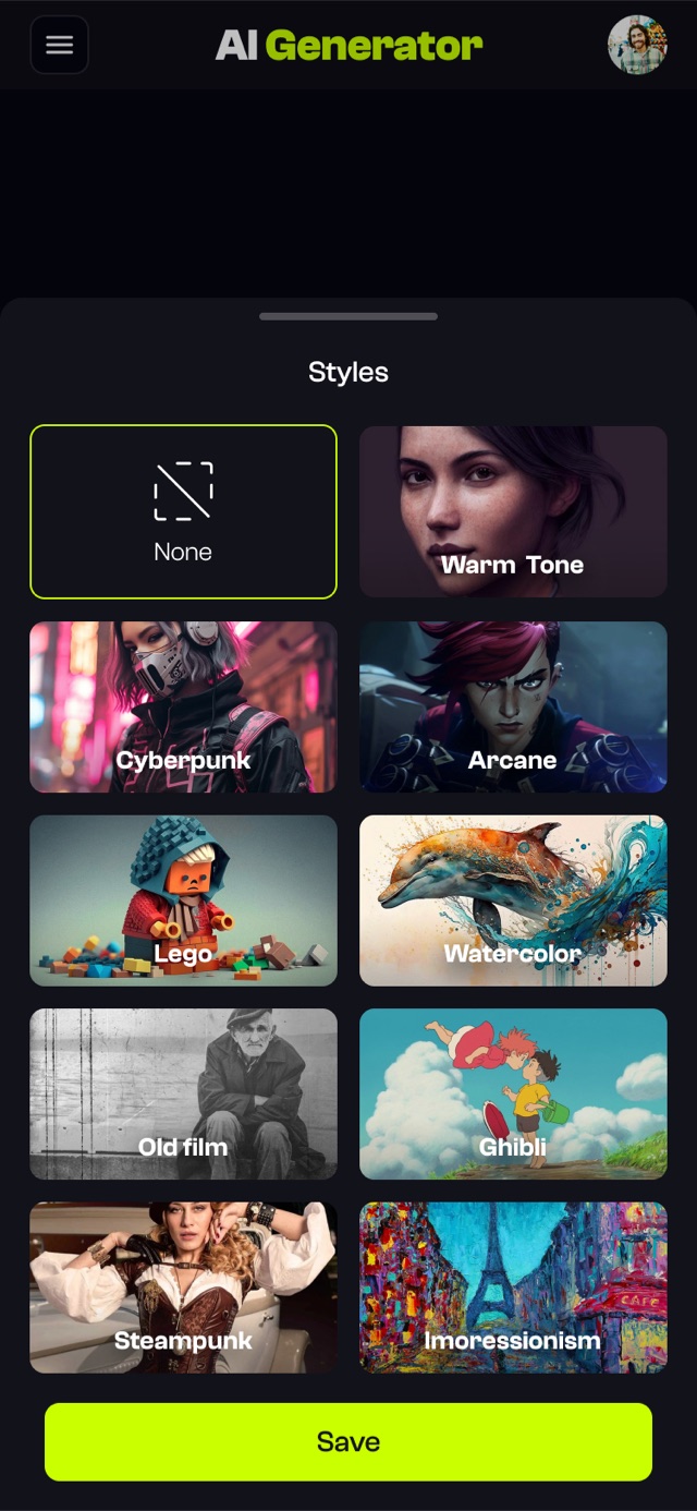
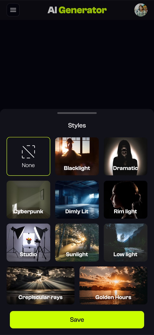
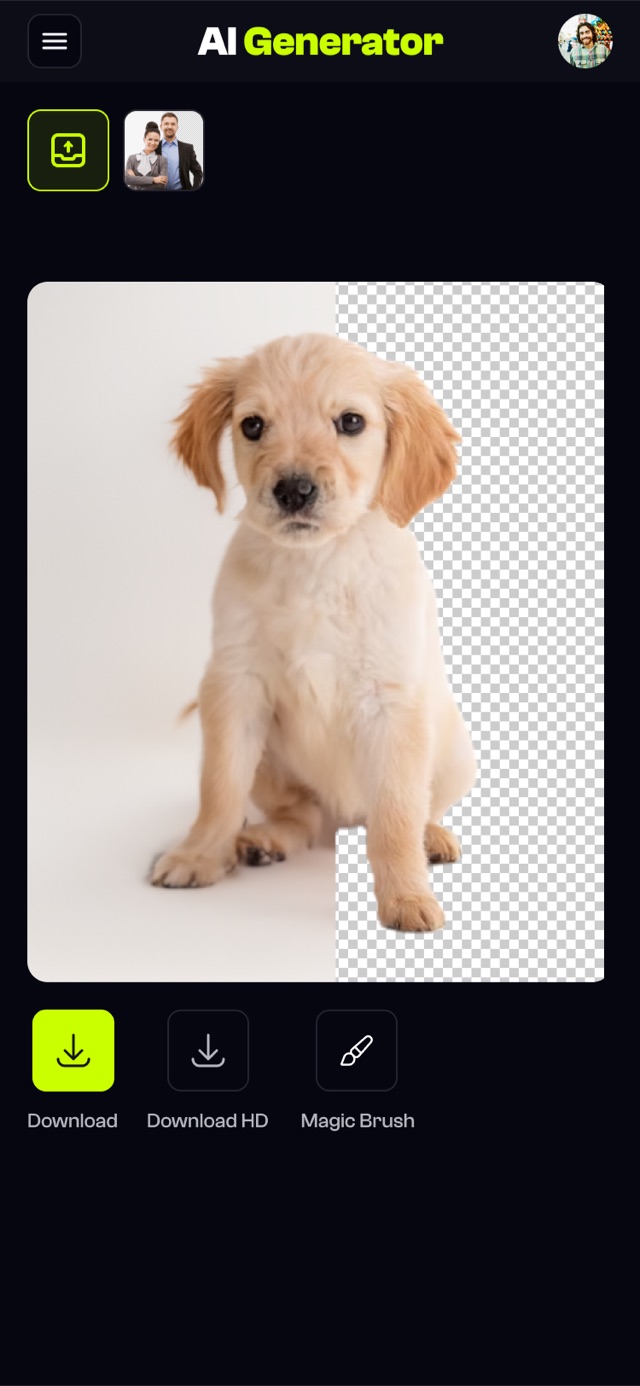
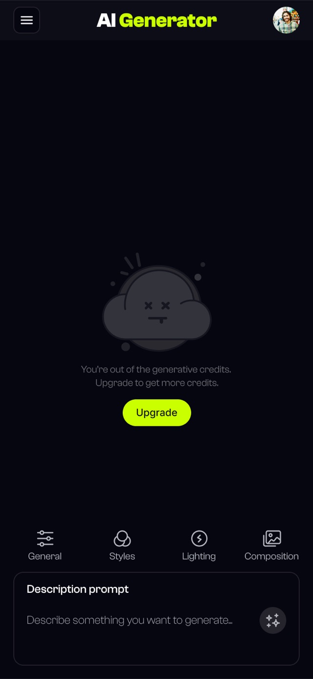
"We don't need a redesign. We need a better model."
Founding CTO, kickoff meeting


Three patterns kept repeating across every conversation.
The problem wasn't the AI.
It was the gap between what users imagined and what they could describe.
How Isolved it.
From user stories to wireframes, the artifacts I produced to turn three research themes into a concrete redesign.
As a first-time user, I want to describe scenes in plain English so that I don't have to learn prompt engineering before I see a result.
As a creator on a credit budget, I want to know if my prompt is strong before I generate, so that I stop burning runs on weak inputs.
As a returning user, I want the interface to stay out of my way so that I can focus on the image I'm trying to make, not the controls around it.
"I kept pressing generate hoping it would just figure out what I meant. By the fourth try I realized the tool wasn't going to meet me halfway."
Natural language, no jargon required. A single field greets the user with three example prompts underneath.
Plain EnglishSuggestions appear inline for lighting, angle, and style. One tap to accept, users learn vocabulary naturally.
Inline assistA strength meter scores specificity, style, and detail before generating. Weak prompts get a nudge, not a failure.
Pre-flightHigh-confidence runs with no guessing. Result screen suggests one specific tweak to try next.
Confident run3 rejected. One chosen.
Type a rough idea. The AI suggests lighting, angles, and style in real-time. One click to accept. Users learn vocabulary naturally.
A fluffy ginger cat curled on a mid-century armchair, soft window light, shallow depth of field
A visual meter scoring specificity, style, and technical detail before generating. Users see exactly what to improve. Confidence +41%.
Prompt field front and center. Advanced settings behind progressive disclosure. 40% less noise. Generate button found 3s faster.
Six themes adjusting density, contrast, and accent colors. Users shape the tool to how they work. Sessions +23%.
The featureI had to kill.
My initial design silently "improved" vague prompts. Output quality +15%. Satisfaction −22%.
"It changed my words without asking."
Agency matters more than optimization.
a dog running in park → A golden retriever sprinting through an autumn park, motion blur, golden hour
Add "golden hour, motion blur" for a more dynamic shot?
Opt-in suggestions, same intelligence, user stays in control. Satisfaction: 2.8 → 4.4/5.
-62%
Time to first image. 8.2 min → 3.1 min.
Timed tasks, 12 participants
The screens.
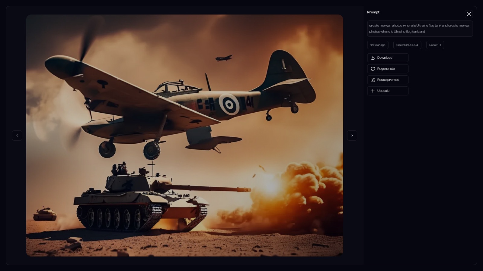
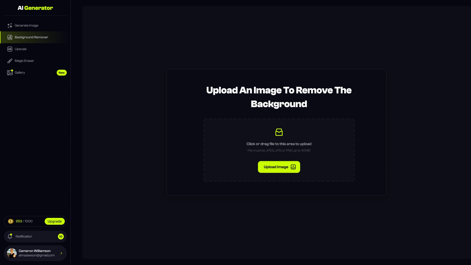
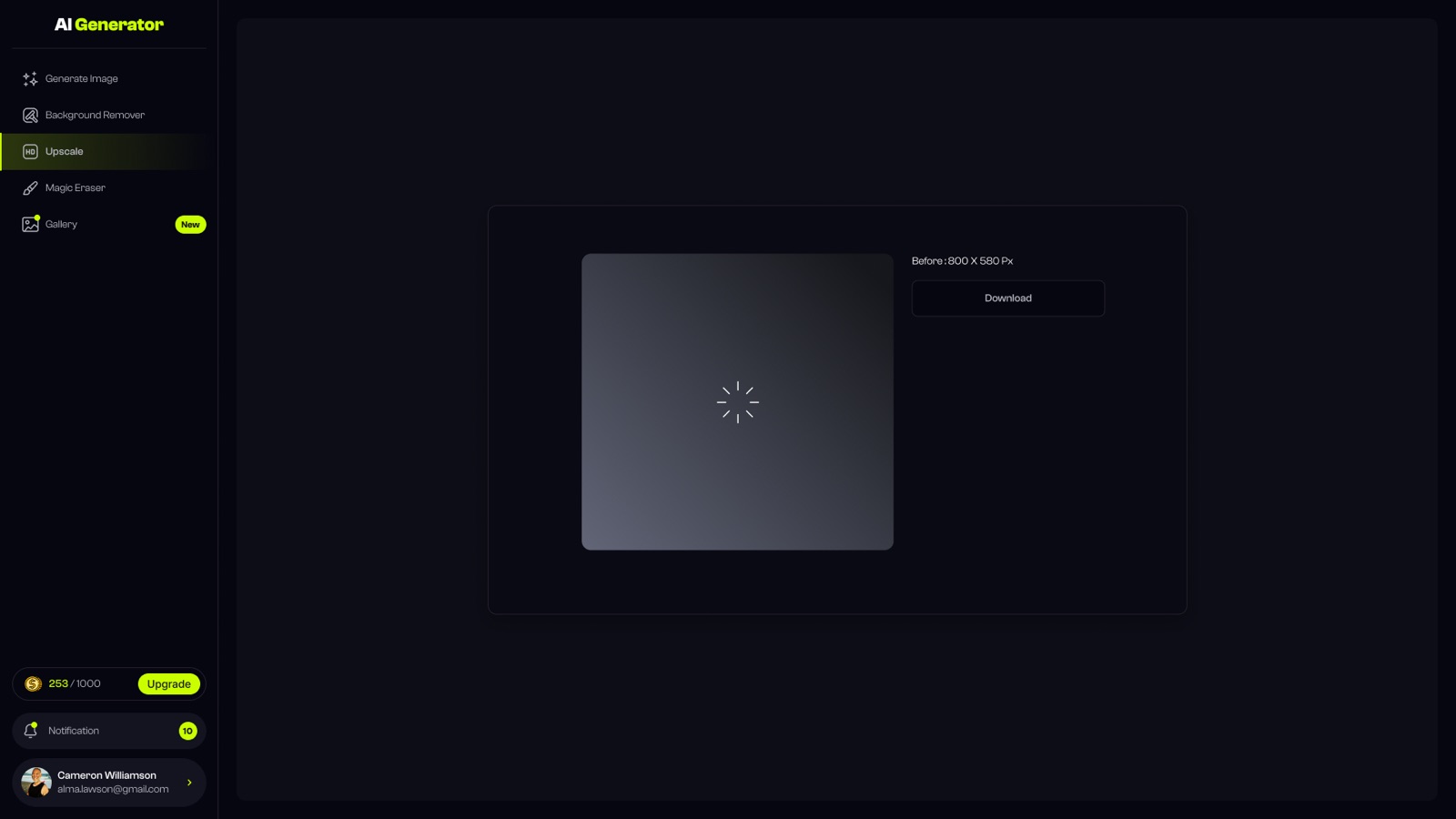
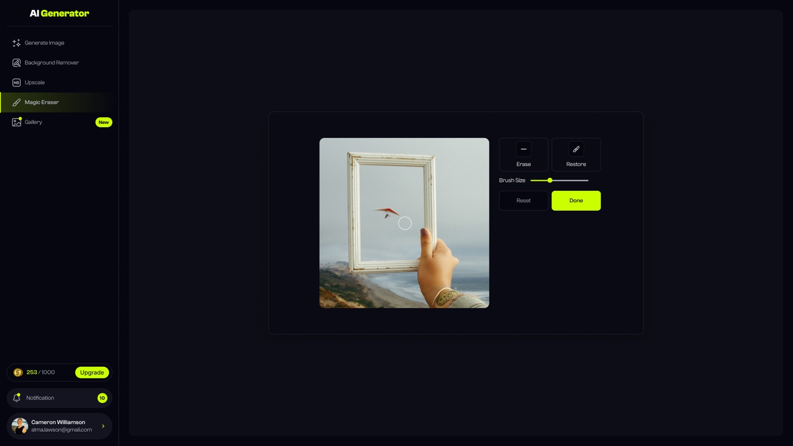
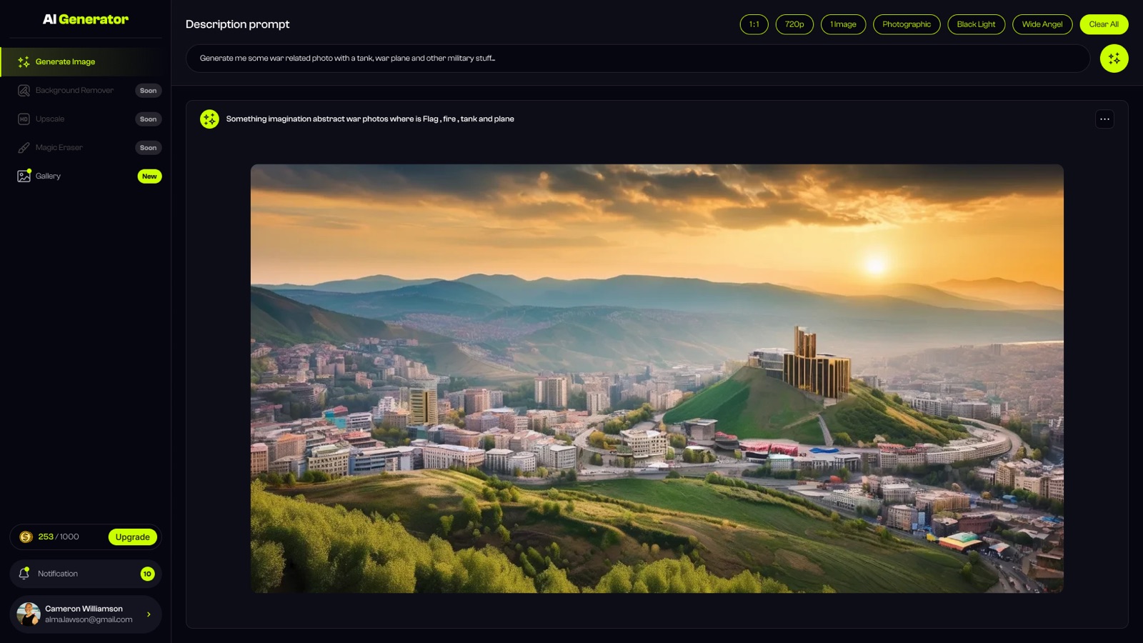
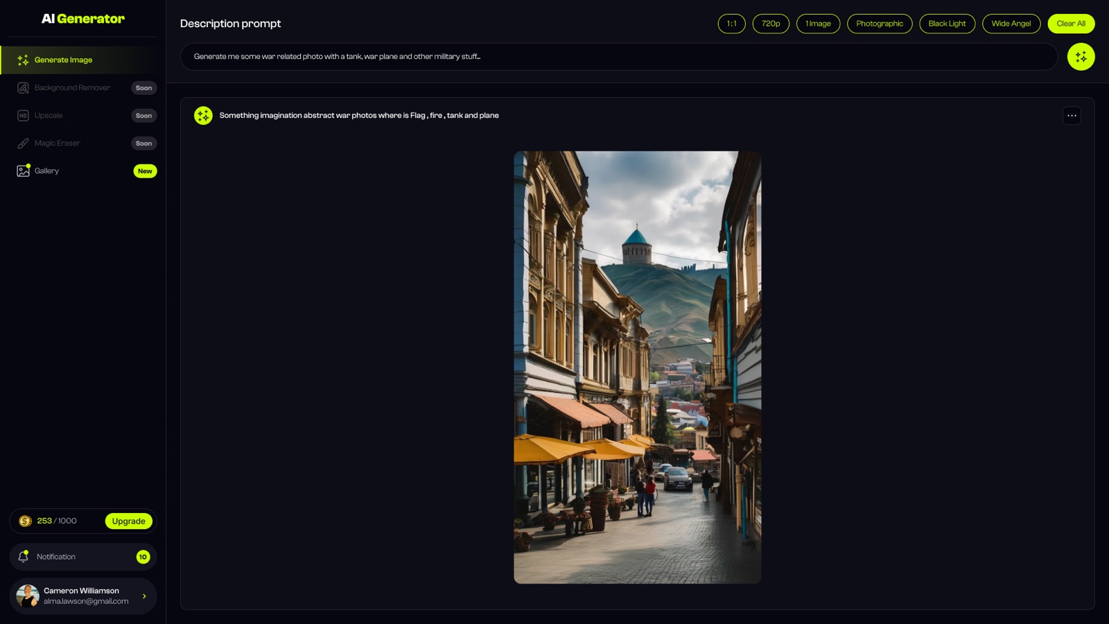
The final product
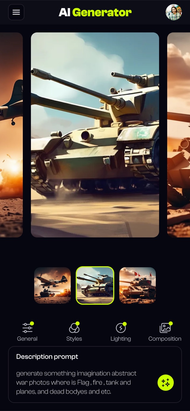

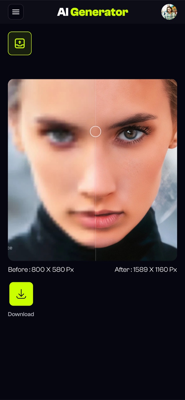
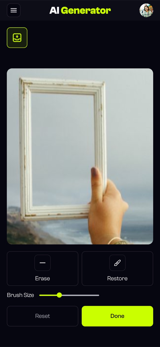
The best features disappear into the experience. Users don't notice the Strength Indicator helping them, they just notice their images got better.
 Beka Jikurishvili
Chat framing made every run feel like a negotiation. Users wanted a canvas, not a conversation partner.
Ten controls on screen tested worse than the audit baseline. Choice paralysis beat the old interface overload.
One prompt field + an inline strength meter. It earned trust by being quiet, not clever, the exact opposite of v1.