Product and growth design for nemora.ai — a shipped, revenue-generating AI companion platform. Not a concept: every screen here is in production, and every design decision answers to conversion, retention and paying users. (18+ product — imagery curated for portfolio.)
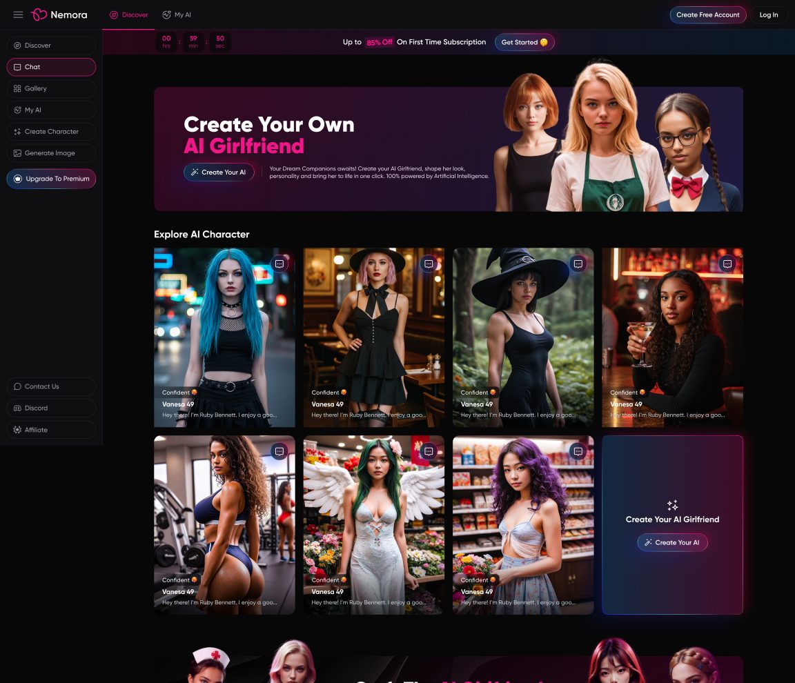
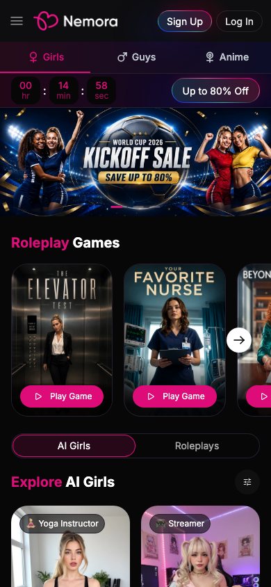
Not a screenshot — the actual product, live. Tap either frame to load nemora.ai. Mobile-first: the phone frame is the primary experience.
Nemora is an AI companion platform — users create a character, chat, and generate images. It's a competitive, conversion-driven market: traffic is bought with ads, and the product has seconds to turn a visitor into a registered user and days to turn them into a subscriber. My work covered the full loop: product UI, the paywall system, pricing, and the entire growth layer — ad creatives, SEO landing pages, blog templates, seasonal campaigns.
It's also an 18+ product, which raises the design bar in a specific way: users want discretion and trust as much as delight. That shaped decisions from billing copy to how imagery is teased.
The AI-companion market is crowded and paid-traffic-driven. I benchmarked the products users compare Nemora against before committing paid ad spend against them:
← swipe the matrix →
The pattern: the big players (Character.AI, Replika) are trusted but tame; the adult-native tools (Janitor, Crushon) are permissive but feel unsafe and unpolished. Nemora's opening was a product that looks as trustworthy as the mainstream apps while being as open as the adult ones — with discretion engineered in.
I clicked out of curiosity. If it takes more than a few taps or feels sketchy, I'm gone.
I've made five characters. I want them to feel distinct — and I want new things to keep coming.
Marcus drove the frictionless mobile entry, the tease-don't-block paywall, and the discreet billing; Devin drove the depth of the character creator, the My-AI management view, and the retention systems (achievements, seasonal drops). The whole funnel is designed to walk a Marcus into a Devin.
← swipe the map →
This screen carries the business. Every element is a deliberate conversion mechanic:
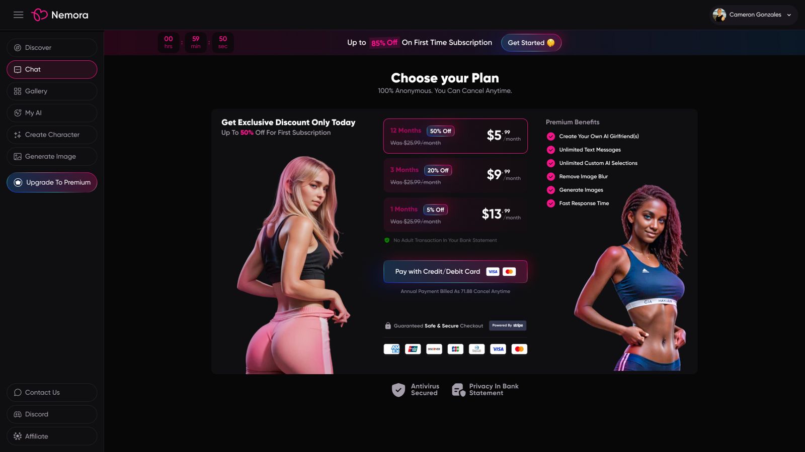
Three tiers priced to make 12 months the obvious deal ($13.99 → $5.99 with the crossed-out $25.99 anchor), a first-visit discount countdown, and "only today" framing. Aggressive — but every claim is real and cancelable.
The line that converts here isn't the price — it's "No adult transaction in your bank statement." Plus Stripe-badged checkout, card logos, cancel-anytime, and "100% anonymous" up top. Discretion is the feature.
Premium content in chat isn't hidden — it's teased. Images arrive blurred with an inline "Upgrade to Premium" chip, so free users experience the full conversation rhythm and see exactly what upgrading unlocks. The benefit list on pricing ("Remove image blur") then matches something they've already wanted. Suggestion chips keep conversations flowing — engagement is the retention engine, and message volume is what makes the subscription feel worth it.
A flat chat box is easy to leave. So the product wraps conversations in scripted roleplay scenarios — "The Elevator Test," "Beyond the Contract," "Fake Boyfriend" — each presented as a cinematic movie poster with a single Play Game button. It's the same gamification logic as an app's daily-quest screen: give people a reason to open the app that isn't "start from a blank page."
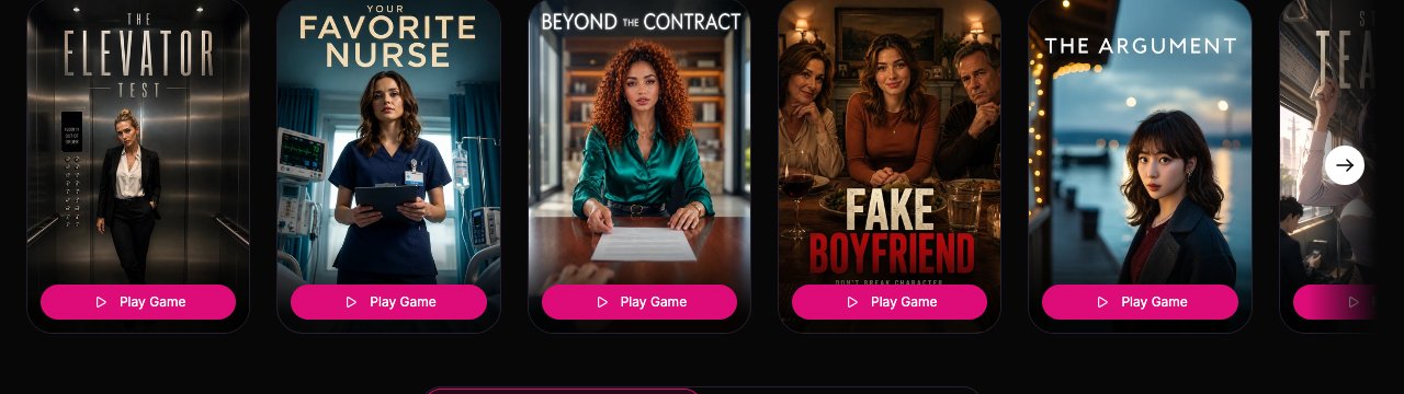
Poster framing sets tone and expectation before the first message, so the chat opens with momentum instead of a blank prompt. It also merchandises the catalog — new scenarios become new "content drops" that pull users back.
Roleplay games sit alongside an achievements layer and seasonal takeovers (Valentine's, Easter) I also designed — the same playbook mobile games use to convert idle installs into daily habits.
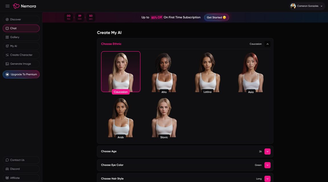
The creator is the product's emotional hook — and a form with a dozen dimensions. The design keeps it feeling like play, not configuration: visual preset grids for the big identity choices, compact dropdowns for the rest, one sticky "Create" action at the end.
The home screen works like an e-commerce storefront: a rotating hero campaign, a character grid with personality tags and hover-to-chat, an in-grid "Create your own" card that turns browsing into creating, and an SEO-oriented FAQ block — because in this market, organic search is a major acquisition channel.
Most of Nemora's traffic is on phones, so mobile isn't a shrink of the desktop — it's the reference design. A persistent bottom tab bar (Discover · Chat · Create AI · Studio · Roleplays) keeps the whole product a thumb-reach away, and the hero, countdown and roleplay cards are all tuned for a single column and one hand.
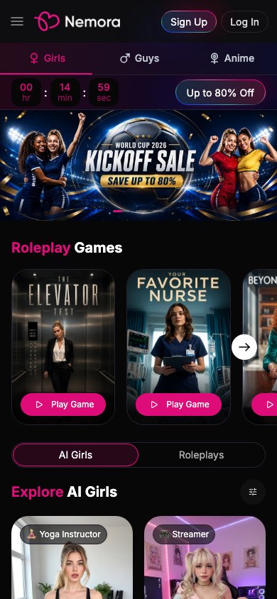 Home — nav & campaign
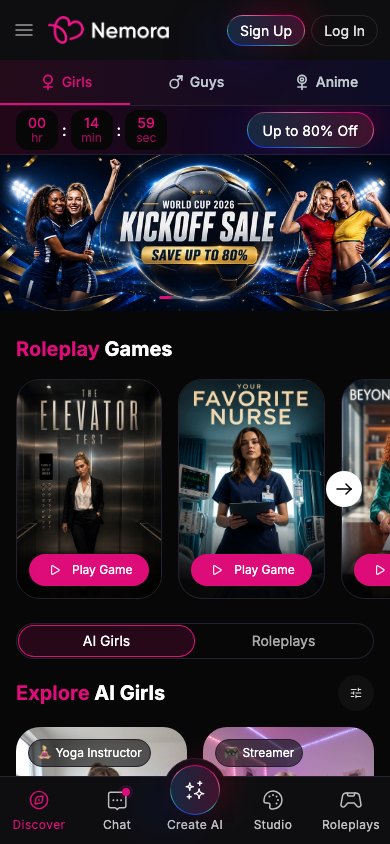 Discover + bottom nav
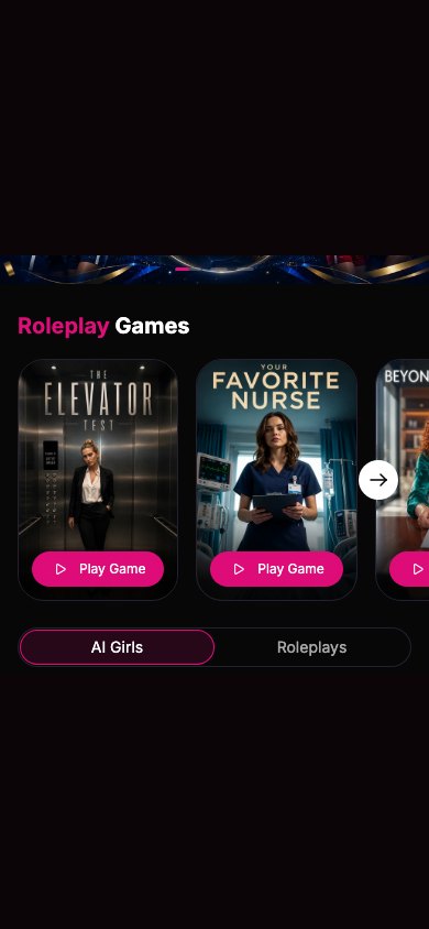 Roleplay games
Captured from the live mobile site. Prefer the real thing? The phone frame up top loads nemora.ai live.
Shipped products need boring rigor: documented brand tokens, opacity ramps, button hierarchies, inputs and tag chips — so a fast-moving team ships consistent UI without me in the room. Below isn't a screenshot; it's Nemora's token set and core components rebuilt in live code — click a swatch to copy its hex, focus the input, tap a tag:
| Heading | Space Grotesk · Bold · 24 |
| Body — teased, not blocked. | Inter · Medium · 15 |
| Caption / meta | Inter · Regular · 12 |
Why this matters: a live product ships faster when its system is unambiguous. Every state above matches the documented Figma spec — and I can rebuild it in code myself.
Half of this job was never inside the app:
That's the part I'd underline in this case study: it's designing a business, continuously, not delivering a file.
The tension in this product is real: conversion patterns like countdowns and anchors work, but overusing them erodes the trust the product depends on. If I started again I'd define the "pressure budget" up front — which mechanics we use, where, and what we never do — instead of negotiating it screen by screen. And I'd bring cohort data into design reviews earlier: we designed against campaign metrics long before we saw true retention curves.
Have a project in mind? I'd love to hear about it.
 Beka Jikurishvili